Overview
Eclipse Theater is a service design project that has been visualized to help users order food and snacks in a dark movie theater setting. This mobile application features a simplistic yet highly effective design, focusing on efficiency and discreetness to achieve the user's end goal.
Role
UX Designer / UI Designer / UX Researcher / Graphic Designer
DURATION
3-week sprint

The Problem
Current dine-in movie theaters have clunky and inconvenient ordering systems that discourage users from ordering food during a movie.
The Goal
To create a mobile experience that would be discrete and easy enough to use during a movie, encouraging users to use their phones in an otherwise traditionally "no technology" setting.
Research
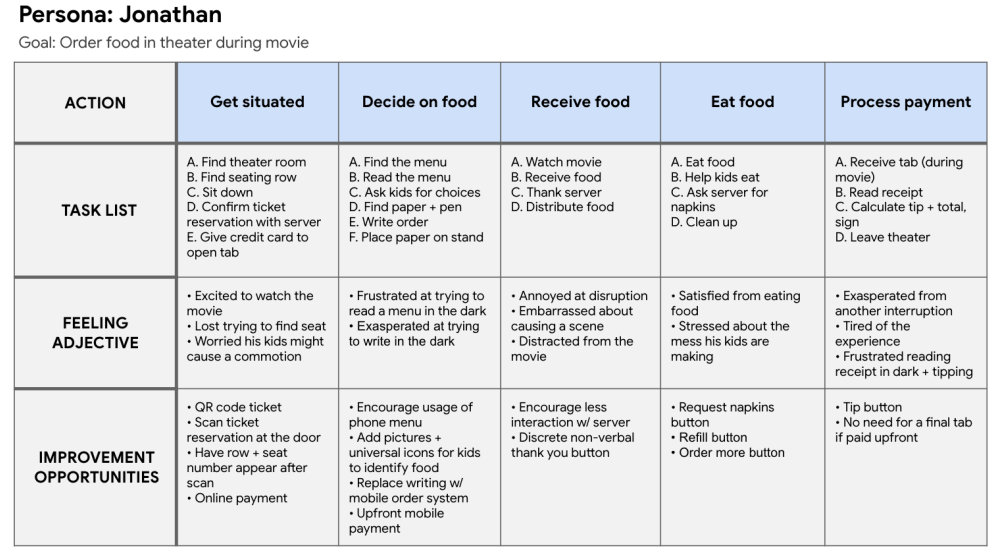
I began to craft a persona and their user journey in order to narrow down user pain points that could occur in a movie theater setting.

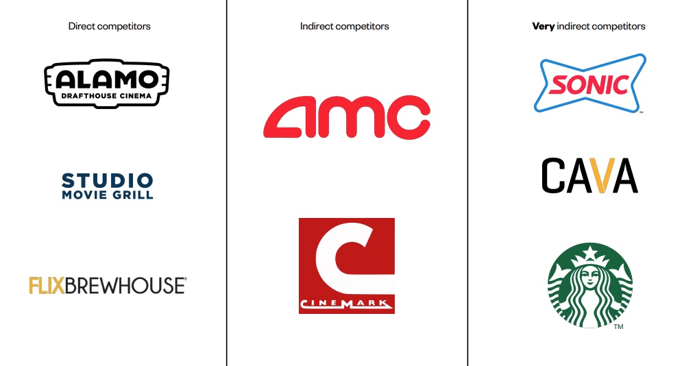
The competitor analysis enabled me to compare and contrast 5 different companies, where I looked at initial impressions, layout design, and user interaction. I also looked into the food ordering process of very indirect competitors, such as Sonic, CAVA, and Starbucks.

Design Exploration
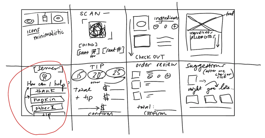
After conducting and analyzing my research, I set off to create user flows and sketches of the mobile application. I focused on streamlining user interaction to achieve the purpose of this app: "As a user, I want to be able to order food at a dine-in movie theater as discretely and quickly as possible."
I used the Crazy 8 design sprint method in order to freely ideate about possibilities for my app. Although rough in the beginning, I was able to draw promising ideas that I applied to my low-fidelity wireframes shown below.


I sent out my wireframes for testing, both in-person and remotely. I found that users:
• were worried about the brightness of the app
• were confused with the placement of the QR code on the homepage
• liked the simplicity and minimalistic nature of the app
• appreciated the action screen dedicated to the server
I considered all of their input and came up with these solutions:
•I made the app using colors that were visible at the lowest brightness setting while still being non-distracting to others
•I made a tutorial at the beginning of the app to lower the brightness and to turn on Do Not Disturb
•I took out confusing icons and opted for more universally known ones
Finally, I implemented all of these changes into my final design.

WRAPPING UP
I learned many things from this project, especially the importance of each role in producing results such as this. Although I take pride in handling this project by myself, I know that this application could've been stronger and more refined if I had more team members to bounce ideas back and forth. I also realized how important user research and testing were -- I personally enjoyed the UI/UX designing aspect much better than the UX research but without it, I would've been making designs that do not coincide with the users' needs and therefore, be useless. I was able to narrow down design functions and the likes at earlier stages as opposed to final, which is something that I came to appreciate about UX research.